Twindr is an odd joke project that got a little out of hand. The app combines “Twitter” and “Tinder” into a less useful tool that uses the Tinder UI to unfollow old twitter accounts. Built by my roommate, Jared Moskowitz, and myself, the app was supposed to be an inside-jokey parody of the tinderification of everything. Ironically, it actually found some small amount of success both as a joke and as an actual tool. Since Jared and I spent $0 making the thing, we decided not to monetize it. Now we’re left with the story of how we made it, how it got a million swipes in the first month, and some of the cool things we focused on in terms of software and design.
Small disclaimer: Jared and I both worked on this, but this post will probably focus more on what I built.

Jared and I built the basics of the app at the Tufts University Hackathon in late 2014. Originally, we had planned to focus on unfollowing old Facebook friends instead of Twitter accounts, but we quickly realized how limited the Facebook API was in terms of executing actions on behalf of the user.
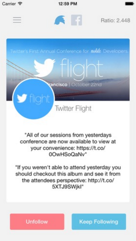
Since Jared and I had built apps together in the past, we tried to focus on areas that were new to us. For example, about halfway through the night, we actually switched roles (frontend / backend) to mix things up. We accomplished a lot in 24 hours, but the app was basically only good for demoing (though we may have told the audience otherwise). There were a handful of optimizations we knew we had to build if we wanted to actually release the app, most urgently thread optimization.
The name “Twindr” was actually yelled across the room at the end of our demo. It was the obvious choice, but I still like the original, “Flip The Bird” (which, hilariously enough, goes against Twitter’s Acceptable Brand Usage).
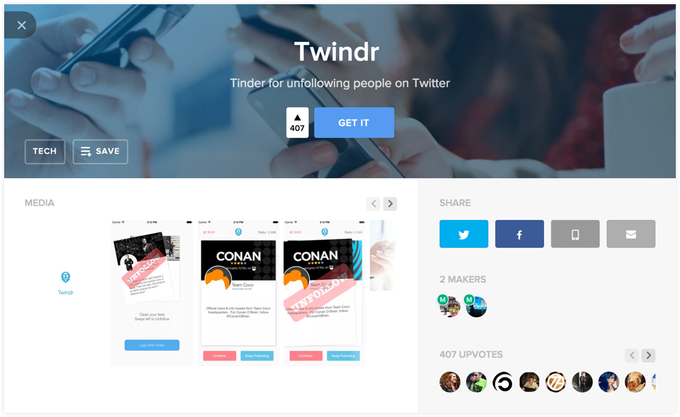
After a few more weeks of development, bug squashing, and questioning whether we should just kill the project, we released the app into the wild. Without really thinking about it, I put Twindr on ProductHunt and totally forgot about it. Jared and I were actually at another Hackathon when we started getting a barrage of tweets talking about Twindr, and that’s when we saw it on the #1 spot with 99 upvotes (back when 50+ was a huge deal).
Gizmodo, LifeHacker, and The Daily Dot picked it up soon after (I especially love the cynical nature of Gizmodo’s article), and then something sort of weird happened. I noticed that people were linking to our webpage correctly, but were using someone else’s screenshots. After some digging, I found that someone built a completely separate app with the same name and functionality, and released it just before ours (Luckily we reserved the name “Twindr”, so he chose “Twindr - blah blah description”). Thinking he had somehow seen our hackathon project, I assumed the worst and confronted him. Turns out it was just a completely random coincidence, and I was just a random asshole yelling at him on the internet. Oops… 😁
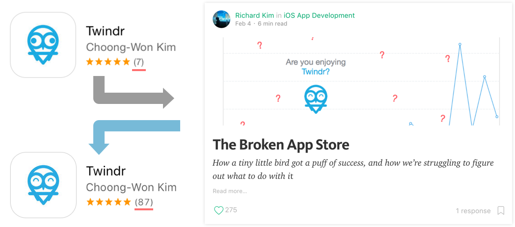
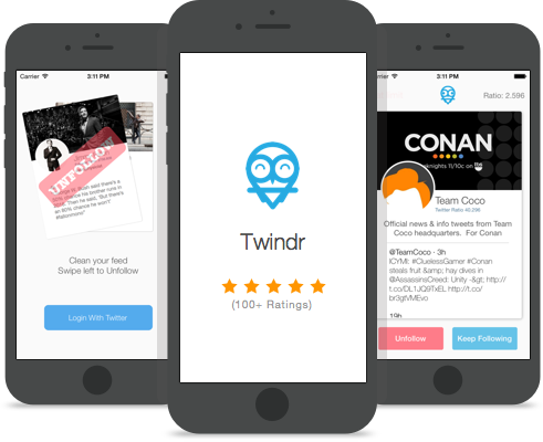
About a month after releasing Twindr, I published a post on medium that had the unintentional consequence of adding almost a hundred 5 star ratings in the app store. Before the article, we were doing pretty well with over 1 million swipes counted in our app, but something was bugging me.
People were requesting for certain features, so I built a full version 2, but was hesitant to release it. We already passed our peak of user acquisition, and we had a nice 5-star rating in the store. If I released the update, we would lose our ratings, and likely wouldn’t get them back. So, I wrote about the conundrum, but submitted the update anyway, throwing Twindr into the pile of 0-star apps. In response, over 20,000 people read the article, resulting in hundreds of sympathetic ratings in the app store! So if you saw the app and thought “wow this must be pretty good for 100 people to genuinely give 5 star ratings”, sorry to disappoint.
Because this was a parody of the Tinder app, a lot of the design work was already done for us. That being said, we still paid close attention to the details, and worked especially hard on making sure the user didn’t know when an error occurs.
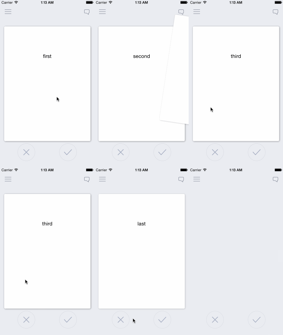
Part of the reason why I enjoyed parodying the Tinder UI so much was because of all the “Tinder for X” ideas I’ve gotten. Around my freshman year of college, I built an open sourced library for the Tinder UI. After it took off, I was bombarded with emails asking me to be the CTO / co-founder / engineer / tech-lead for the next “Tinder for X”. So naturally, I used my own library for this project.
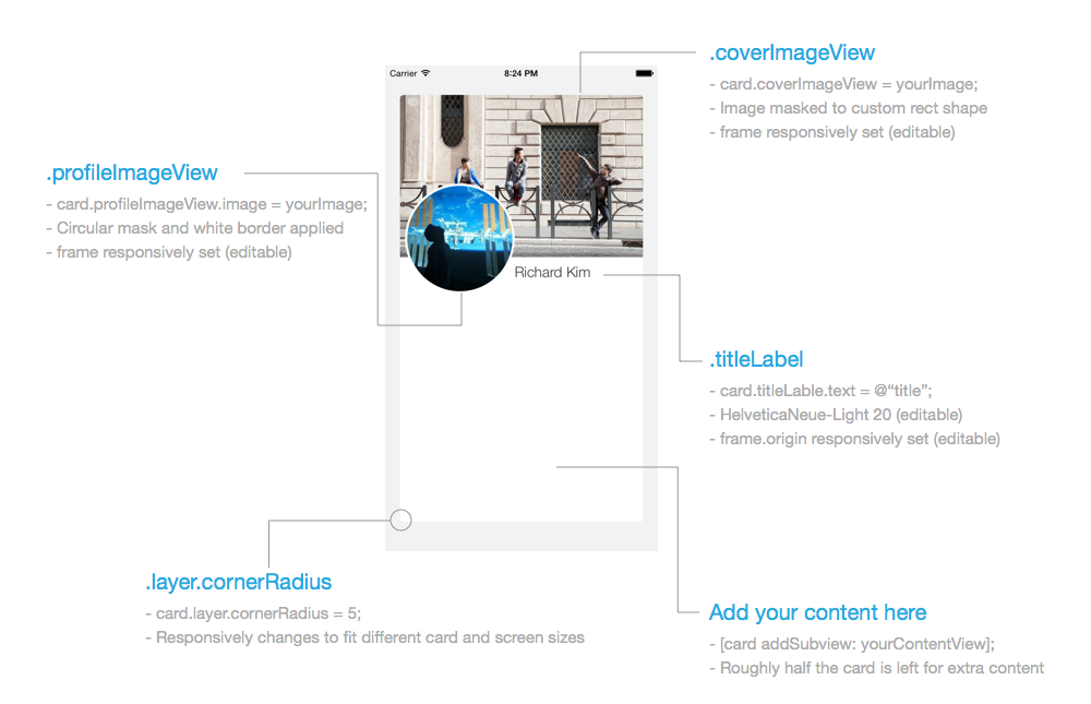
To fit our design goal of absolute simplicity, I decided to model (copy) the basic card design off of Facebook’s mobile app. The result was pretty decent, and I actually ended up formalizing it and open sourcing it after building Twindr. Despite the design’s simplicity, we still had a few interesting error cases that we decided to handle through the design.
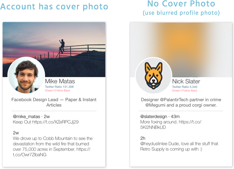
The first error case occurs when a Twitter user is missing information such as a profile picture, a cover photo, a description, tweets, etc. Instead of informing the user about the absence of this information, we decided to design around it. Above you can see how we simply use a blurred profile photo when a user lacks a cover photo.
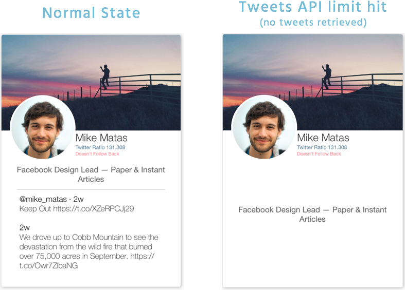
The second major problem was that Twitter’s API didn’t allow us to collect a bunch of tweets from a bunch of users in one request. So, we quickly ran into the tweet API limit, but could still pull user information. Instead of having an error popup, we simply removed the tweets section and centered the description instead. When this occurred, we also gave the user the option to find out what happened via an information button in the top left of the app.
The architecture behind Twindr is super simple. However, we found that because we built most of the code in 24 hours for a demo, we made certain short-term architectural choices that hurt us in the long run. As a result, we had to make a few compromises if we wanted to avoid building it all over again. Below you will see the ideal architecture, and our lazy architecture.
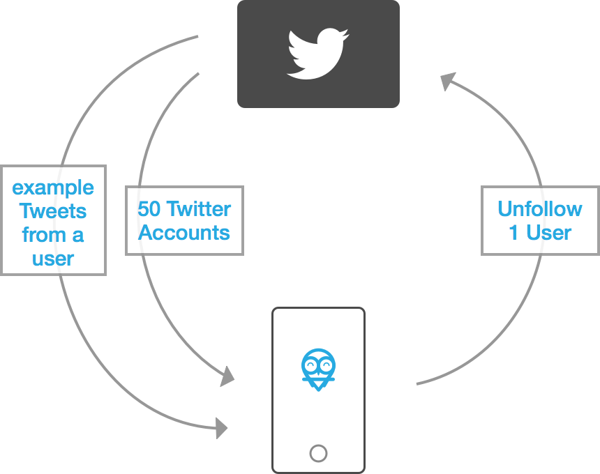
In an ideal design, we’d pull 50 or so Twitter users once the user logs into the app. Then, when the stack dwindles, we pull 50 more in a background thread and add those to the bottom of the pile. At the same time, we have the top 5 cards load example tweets, photos, etc so that all the information is ready to go when the user sees the card. Finally, we have the unfollow requests run in a separate, low-priority background thread. The only thing running in the main thread is basically the UI.
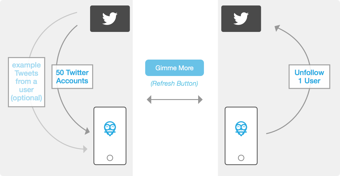
For the demo, we decided to build everything on the main thread to avoid race conditions. This meant the app was significantly slower, but we could tell the story and explain the tech in between the moments of stuttering. When we built the final version, we brought a lot of the functionality in the background, but instead of having the app intelligently fetch to give the illusion of an unending deck, we decided to have the user manually refresh the deck via a “Gimme More” button. Additionally, we made the downloaded information (example tweets, photos, etc) optional, and used the design tricks explained previously to hide any missing downloadables. That way we didn’t have anything blocking the main thread, and the swiping was allowed to be super fast.
To this day Jared and I still get emails about the app. We get everything from feature requests to bug reports to “what do you think about my spinoff of your idea”s. Fortunately (or unfortunately I guess), Jared and I have moved on from the project. We’re still in college and still living together, but we’ve decided that if we spend any more time on Twindr, it would be hard to maintain its status in our lives as a joke side-project. In fact, in summer ‘16, Jared will be going to Microsoft and I will be going to Google. Twindr went way beyond our expectations, and though we have discontinued developing the app, Twindr will forever remain free and ad-free.